
AR UI Design



These three elements are the original main menu that I designed for Astral Raiders, brought to life by another of my teammates. The initial UI setup for both the main menu and the in-game shop had a circular design to them at first.
The idea behind this first design was to minimize the space taken up by the menus as well as avoid any sharp lines or corners on a flat, 2d surface.

This was the original shop menu design. Two examples are featured below this, but the white outer rim would contain pngs of the Emplacements, which the player could select to purchase one. The center would display some basic information, like cost and a brief description of the Emplacement's function when the reticle hovered over the icon.
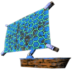
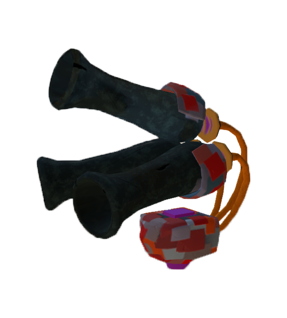
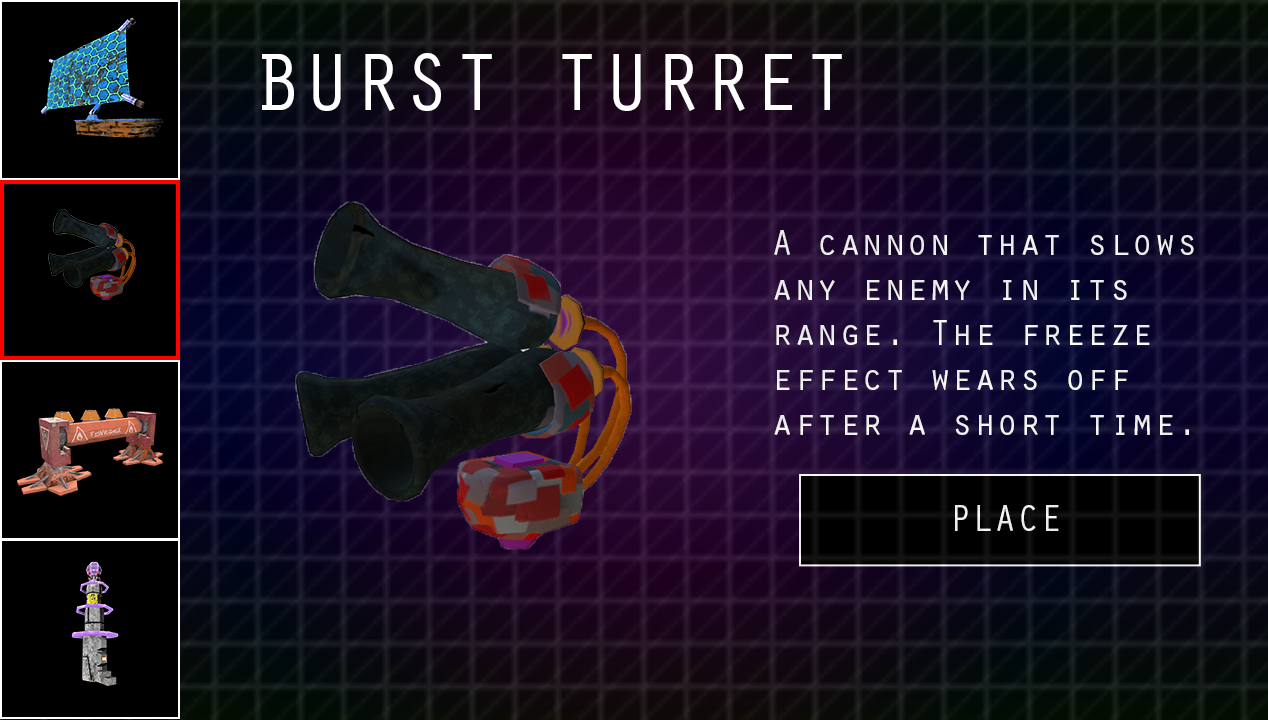
This iteration of the shop menu was the work of myself and my teammate and fellow Designer James Fulmer. While the above image is not the final design of the shop menu, it is the first iteration of what became the final design. Players would hover over and then select the icon of the emplacement they wished to purchase, before selecting Place on the opposite side of the menu in order to finalize their choice of purchase.
The final version replaced the pngs of the Emplacements with icons designed by the team's dedicated concept artist, Dani Banner, as well as had a button to exit the shop if the player didn't want to make a purchase or had opened it accidentally.
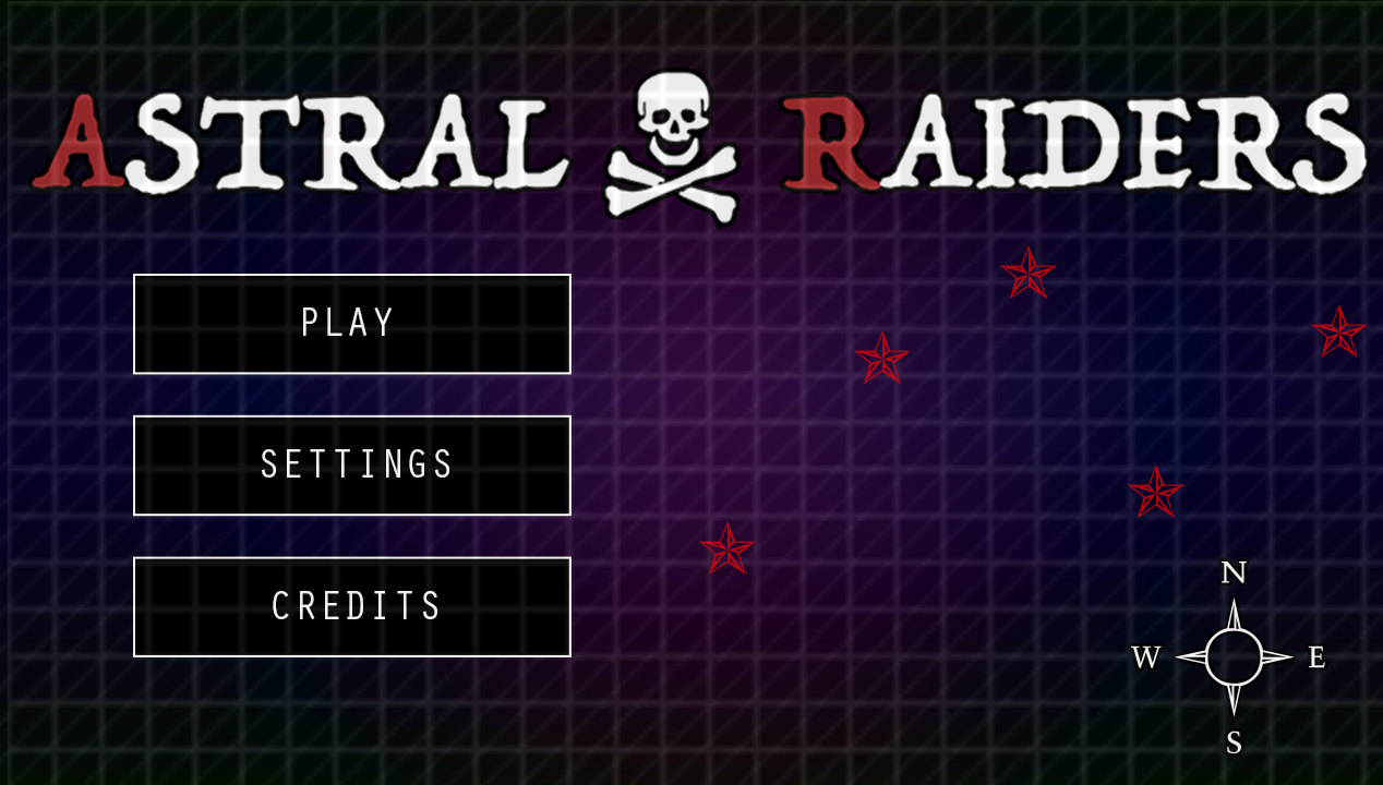
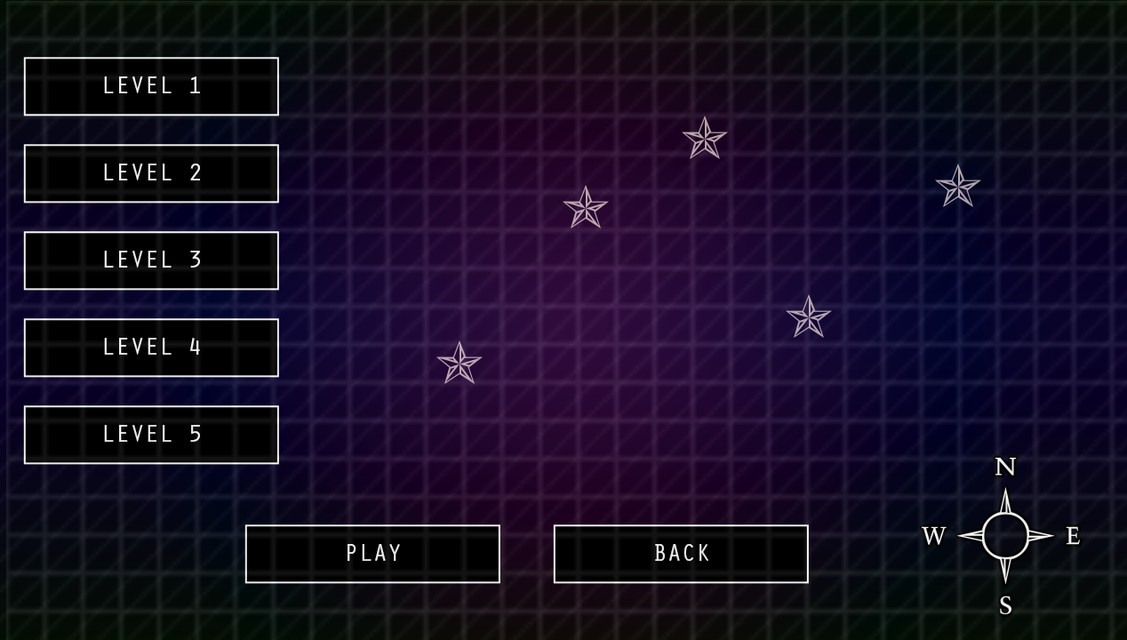
These two images were the main menu designs James and I worked out. While the Level Select menu and function were cut from the final project, the overall design of the menus stayed. We did, in the end, convert all of our buttons over to three-dimensional buttons once that option became available, however.

This is a hand-drawn gear that I requested from the art team to serve as the icon marking how much Scrap a player has available to them. While this feature was originally in the top right corner, in the style of a Heads-Up-Display, it ended up being moved to hover over the ship that you defend while playing Astral Raiders, which is also the location of the shop. The Scrap amount would be displayed in the center of the gear.
It would shrink when the shop opened, originally into the top right corner of the shop menu, then down to the bottom center, hanging half-way off the bottom. Our Lead Programmer, Vincent Slifer, had the idea to turn it into the health indicator for the ship.
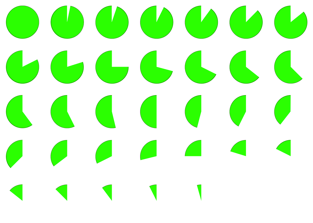
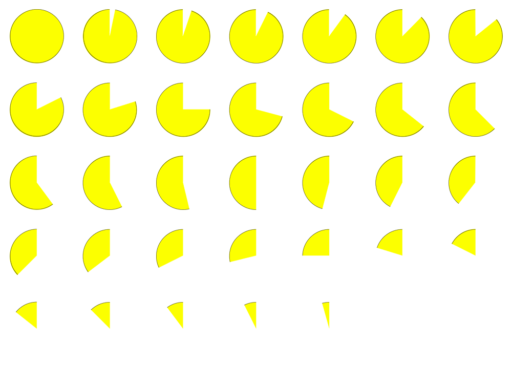
This and the spritesheet below were a simple element that I decided was necessary to help emphasize the state of the Burst Turret. Since all three of the other Emplacements have very flashy indicators of their current state, this green circle, and the yellow one below, serve as added indicators of the Active-Cooldown-Idle states for the Burst Turret.
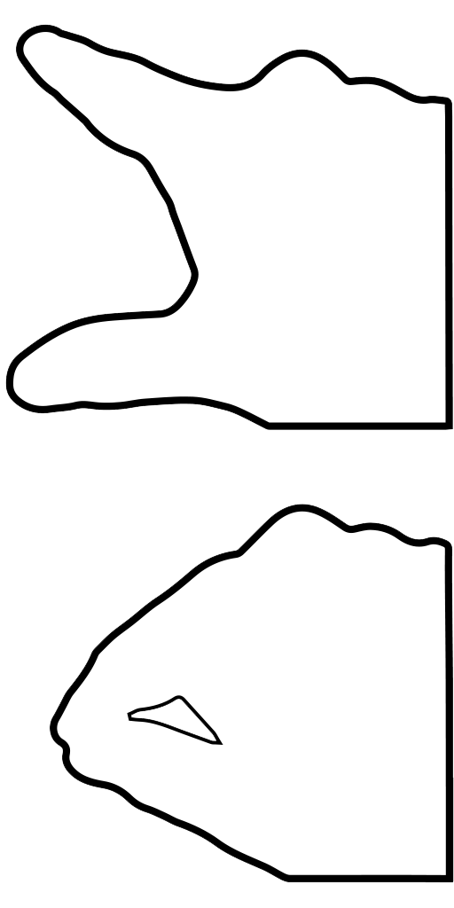
This was an addition to the Tutorial of the game, meant to help emphasize the simplicity of the controls for first time players. While it isn't exactly a complex game in terms of controls, Astral Raiders was developed with thoughts of inexperienced players, who may have never heard of the Microsoft Hololens before, in mind.
